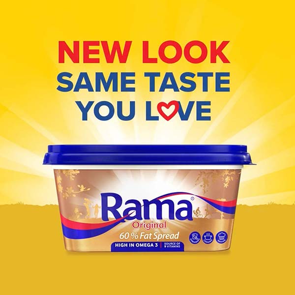
From its distinctive gold colour to its proud red and blue banner, Rama is not only an iconic brand, but an iconic pack too.
But, like any brand, Rama needed to evolve to remain relevant (and appealing) to consumers whose tastes and values were changing. Starting with the pack.
Enter the THB Disturbance team … enter a new world of goodness.
Our approach to the new-look pack was simple: we kept the elements consumers know and love but gave the pack a fresh visual landscape. In other words, we retained the brand’s distinctive assets but reimagined a new world of goodness.
The design introduces a thriving landscape – cueing goodness and happy, healthy families while retaining the reassuringly familiar Omega 3 and Vitamin callouts as well as the trusted versatility icons.
The characters on our thriving landscape were brought to life in a series of short animations that celebrated what consumers know and love about Rama: the importance of family and togetherness, of healthy living and delicious eating.

